 Robo Instructus devblog
Updates on the development of coding puzzler Robo Instructus
Building The Beta
I'm a game developer currently working on robot engineering puzzle game Robo Instructus. For my previous posts look here.
It’s been a busy week.

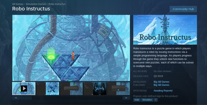
Earlier this week I released the Robo Instructus beta on Steam, along with a public signup at www.roboinstruct.us. At this point I’ve had around 3000 sign-ups and already received lots of feedback from people testing the game. Thank you everyone that signed up!
Getting from the alpha to the beta was more than just a rename though. Previous builds of the game were missing some important bits and these all had to be filled in before I could call the build beta and let many more people have a look.
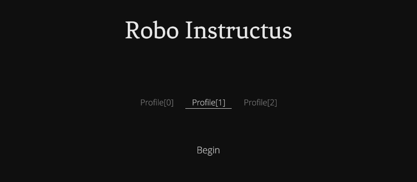
Title screen
The alpha builds had simply done without a title screen. The first time you ran it you’re plopped into a placeholder level selection screen with a single dot. This isn’t a very impressive start for any game I think, so the beta had to do better.

A title screen is somewhere you can hear the main theme of the game and a natural place to manage save profiles. It’s a launch pad into the game the first time you ever run it.
There are some things I don’t like about title screens in games though. Do I really need to go through it every time I launch the game or want to quit? In my game the answer is no. It’s actually possible that you’ll only see this screen once ever, as all parts of the game offer direct “Save & Quit” and when you open the game it’ll throw you straight back to where you were.
Introduction
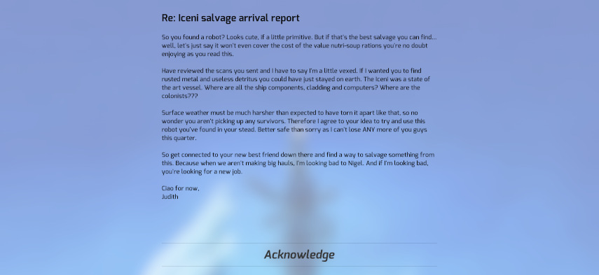
The title screen, rare as it is, offers that new game launch pad into an intro. The alpha had no intro, so players had no idea who they were and what they were doing in the fiction. With the beta the game has started to give it little more here. Robo Instructus now has a short intro; you’re a salvage engineer and here’s a message from your boss.

This is a simple but significant step to telling the story of the game. Players now have a little more direction as they throw themselves into mastering the puzzles of the scaffold levels.
Level selection
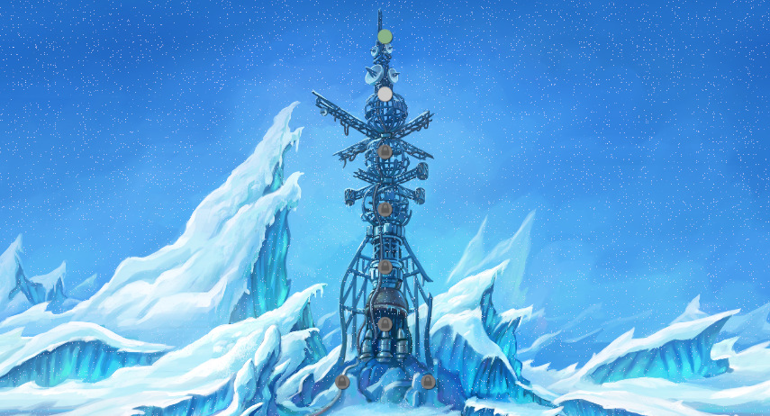
Most importantly Tom finished off the level selection screen background art. This means I can finally remove the visually assaulting placeholder background and players can get a lovely look at where they are and what they’re descending into.

What a difference quality art makes. This screen still has a lot of improvement in store, but having it look the part just makes the game feel that much more complete.
Beta objectives
While the initial beta is much further on from the alpha builds, there remains much to improve. During the beta months I want to smooth out all the initial difficulty issues so the early levels give you a ramp to launch into the much harder puzzles below ground. Early reports so far have been low on bugs, but I want to squash all and any we find so that the full release is as solid as possible.
There’s still half of the game not in the beta, though the levels are already designed. Lots of art work remains, the game is missing lots of fx and animations. So Tom will be busy during the beta!
I’d also love to build a little community around the game and this begins with the beta testers. But I’ll talk more about the beta effort in future posts. I’ve already released the first big beta-1.2 update and more improvements are incoming. This is going to be fun!